Talk about a Ring of Fire.
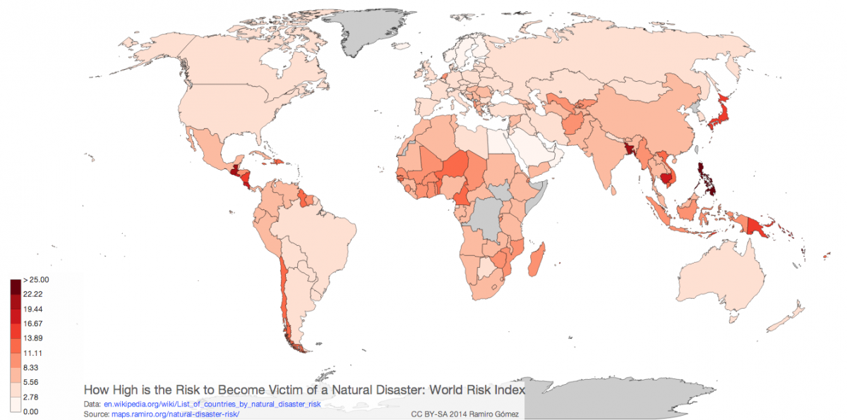
|Map developer Ramiro Gomez has created an interactive map of theworld that's color-coded based on the United Nations' World RiskIndex, showing which countries have the highest exposure to naturaldisaster risk.
|Safer countries are in lighter shades of pink, more dangerousnations are closer to red.
|In short, and we generally all knew this already, the southPacific is a dangerous place to live. The tiny island nationof Vanuatu off the coast of Australia is the deadliest countryin the world, based on the UN's metrics, with a 36.43% disasterrisk. Tonga, which is nearby, comes in as the second-deadliest at28.23%.
|How does the rest of the world stack up?
|Click on the map below for a larger version, or head over toGomez'ssite for the full interactive map.
|
Want to continue reading?
Become a Free PropertyCasualty360 Digital Reader
Your access to unlimited PropertyCasualty360 content isn’t changing.
Once you are an ALM digital member, you’ll receive:
- All PropertyCasualty360.com news coverage, best practices, and in-depth analysis.
- Educational webcasts, resources from industry leaders, and informative newsletters.
- Other award-winning websites including BenefitsPRO.com and ThinkAdvisor.com.
Already have an account? Sign In
© 2024 ALM Global, LLC, All Rights Reserved. Request academic re-use from www.copyright.com. All other uses, submit a request to [email protected]. For more information visit Asset & Logo Licensing.