Talk about a Ring of Fire.
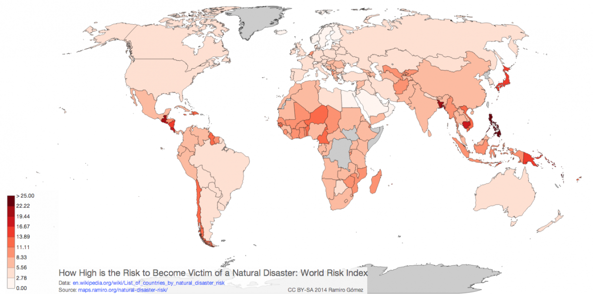
Map developer Ramiro Gomez has created an interactive map of the world that's color-coded based on the United Nations' World Risk Index, showing which countries have the highest exposure to natural disaster risk.
Safer countries are in lighter shades of pink, more dangerous nations are closer to red.
In short, and we generally all knew this already, the south Pacific is a dangerous place to live. The tiny island nation of Vanuatu off the coast of Australia is the deadliest country in the world, based on the UN's metrics, with a 36.43% disaster risk. Tonga, which is nearby, comes in as the second-deadliest at 28.23%.
How does the rest of the world stack up?
Click on the map below for a larger version, or head over to Gomez's site for the full interactive map.
© Arc, All Rights Reserved. Request academic re-use from www.copyright.com. All other uses, submit a request to TMSalesOperations@arc-network.com. For more information visit Asset & Logo Licensing.